

Designing for intuition unlocks understanding
How abstractions in design speed up first-use, but prevent deeper understanding of systems

This recent post from Geoffrey Litt highlights a problem all too common in the design of modern products. He calls it the "nightmare bicycle":
Imagine a bicycle where the product manager said: “people don’t get math so we can’t have numbered gears. We need labeled buttons for gravel mode, downhill mode, …”
This is the hypothetical “nightmare bicycle” that Andrea diSessa imagines in his book Changing Minds.
As he points out: it would be terrible! We’d lose the intuitive understanding of how to use the gears to solve any situation we encounter. Which mode do you use for gravel + downhill?
It turns out, anyone can understand numbered gears totally fine after a bit of practice. People are capable!
These kinds of interfaces seem to be everywhere these days. Bikes, microwaves, anything digital.

In search of a mass market, designers quest for interfaces that abstract away the underlying workings of the system. Every function needs a preset or a simplified shortcut button to do single-purpose, repetitive (in the designers' mind) actions. Think popcorn button on your microwave, or the gravel setting on the bike, or even "sport mode" on your car's transmission. Each of these provides an abstraction for controlling its underlying mechanisms.
All systems have variables we interact with to control what they do. The microwave has time and power. The bike has front and rear gears. A camera's got shutter speed and light sensitivity. The variables of the system interact in unique combinations to produce different behavior. We press "melt butter" on the microwave, but in reality it's just a shorthand for a power level and time. Unfortunately, what it's actually doing is often hidden from us.
The same nightmare interfaces appear on every home appliance, piece of electronics, or — one of my personal most-hated examples — every control on the car dashboard.
With these kinds of interfaces, "too clever by half" is a phrase that comes to mind. The designers try to get too clever, and attempt to provide an abstraction for every use case.
When a product design relies too much on abstractions, it makes it hard or impossible for the user to learn the underlying mechanics of its operation.
In pursuit of making things "easier to use", we might actually be making them more difficult or frustrating.
Abstractions like this do provide value for users, or at least that's the motivator for building them. They allow users to get started with a product with minimal learning. Knowing nothing at all about my microwave, with a pound of chicken fresh from the freezer, I can hit "defrost" and type 1.0 lbs. I may have no clue what power level or time is actually needed to get the job done. But the modern microwave doesn't always let me in on its formula: the abstraction hides from me the actual inputs, so I don't even get to learn the minutes/power-per-pound ratios that could help me in future cases.
Bad abstractions only provide surface learning, not fundamental understanding of the system.
With the nightmare interface, abstractions prevent the user from building a mental model of the system's inner workings. Without a reliable map of how the system works, we have no sense of how to go outside the guardrails of its usage. Edge cases are a pain because they require going off-script. But when we go outside the guardrails, our lack of knowledge of how the system's components work together makes it hard to navigate.
It's like being on a boat and only knowing how to navigate by instrument, staring at the dot on the GPS. But when that GPS fails you, you're adrift. Conversely, if you build the knowledge of a few basic abilities like reading a compass heading, calculating your speed, and plotting your position on a chart, you can dead reckon your way.
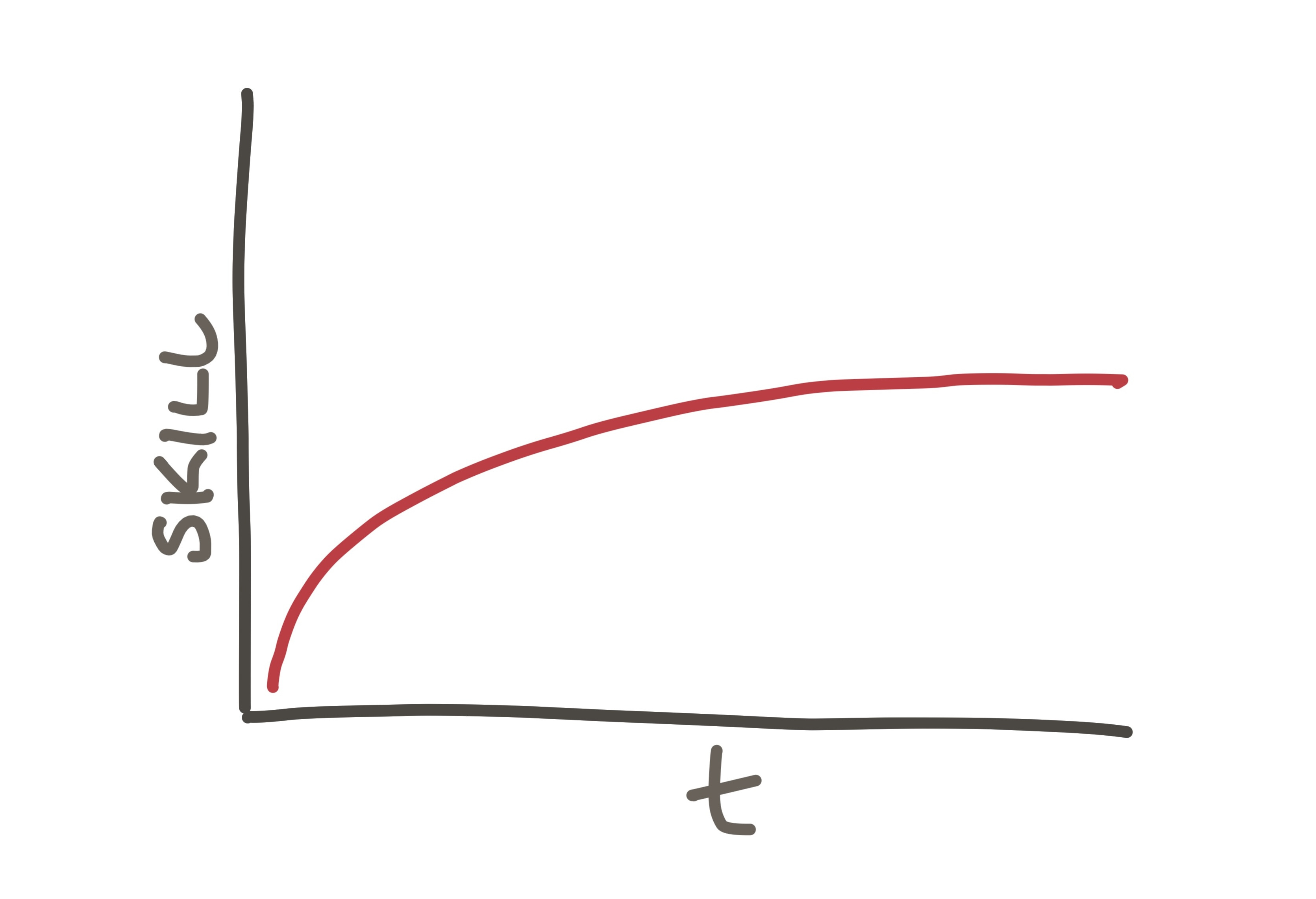
The abstraction gives us a steep increase in usability right away. It has the benefit of immediacy, but plateaus early. You learn how to start and do the basics quickly, but never build a rich understanding:
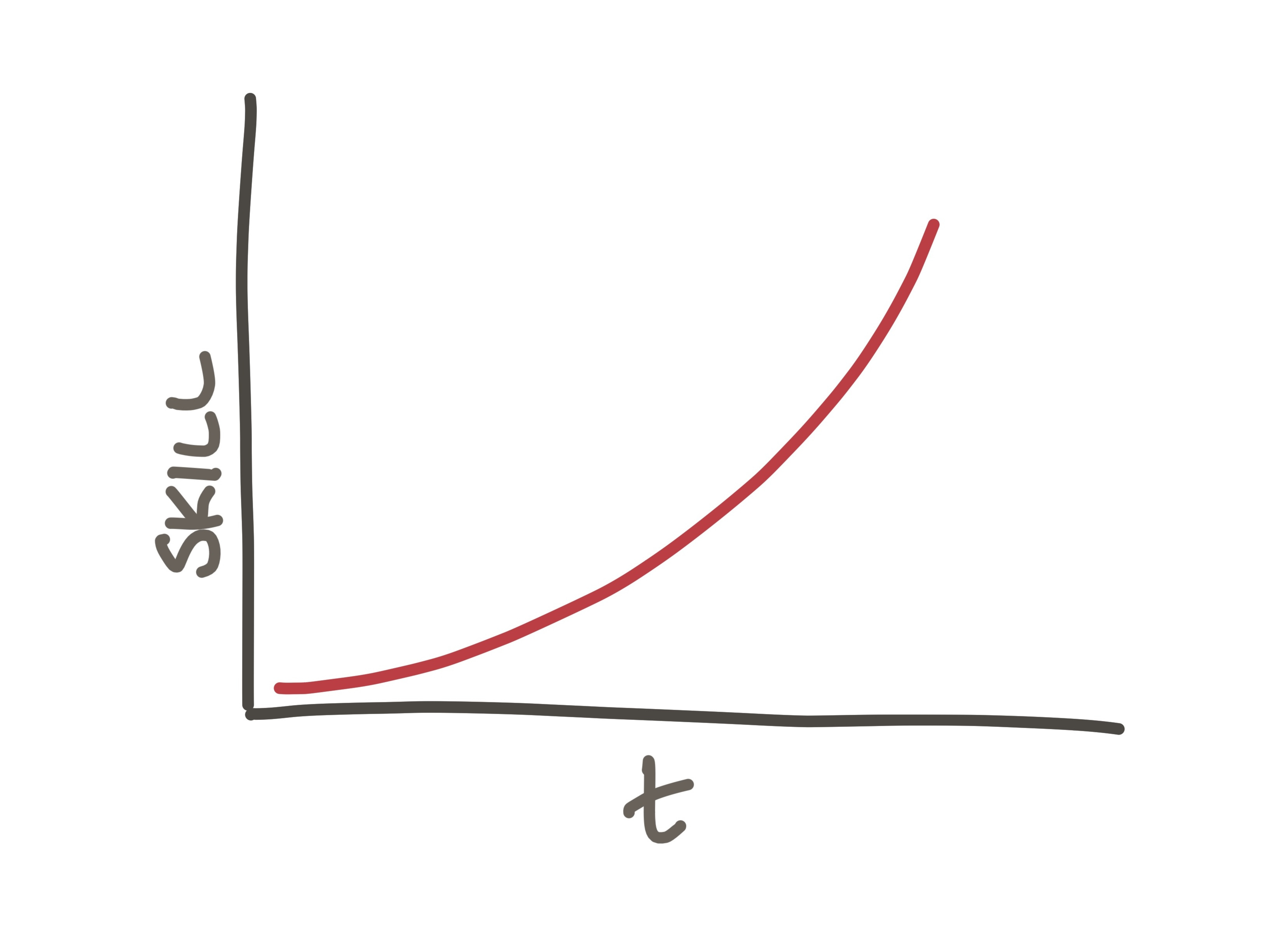
Intuitive, natural interfaces take longer to build competency with, but offer much higher ceilings with rich understanding.
Learning how the bike's gears work with a simple numeric gear shifter requires you to do some riding first. You do some pedaling, riding uphill and downhill, and on different surfaces, modeling the system relationships in your head. The amount of force required in high gear versus low gear on hard ground or up an incline.
But the feedback comes quickly, and the intuitive "feel" you build with a little trial and error is much more resilient, useful learning:
Good designs expose a system's structure in a way that balances the speed and ease of getting started with the ability to understand the fundamental system dynamics.
Bad designs mask the real variables and block the user from learning the system. They require memorizing arbitrary rules instead of offering a set of basic relationships and behaviors that let us reason toward understanding.
Good design makes the underlying system legible so users can build a workable mental model, and improvise in novel situations. They surface the generative logic so users can reason, explore, and extend.
Given an intuitive design and a little time to experiment, a curious user builds a mental framework that predicts how the system will respond to new inputs.
Cracking the intuitive approach to a product's design is worth the trade-off. People are resilient and capable, and the learning they'll achieve with a few minutes of use is worth the investment.
I'll leave it with this, from Geoffrey's post:
You can just have a time (and power) button. People will figure out how to cook stuff.
Good designs expose systematic structure; they lean on their users’ ability to understand this structure and apply it to new situations. We were born for this.
"We were born for this".
Human brains are meant to handle the gradual ramp of intuitive learning. In our design processes, we should trust our users' abilities more.